A full read of anonymised Axo data: only 54% of biomarkers optimal on average, 9.6 out of range per person, plus hidden risks like Lp(a) that standard panels miss.


This report draws on anonymised, aggregated Axo data. No individual is identifiable, and figures are reported only at the level of the whole group.
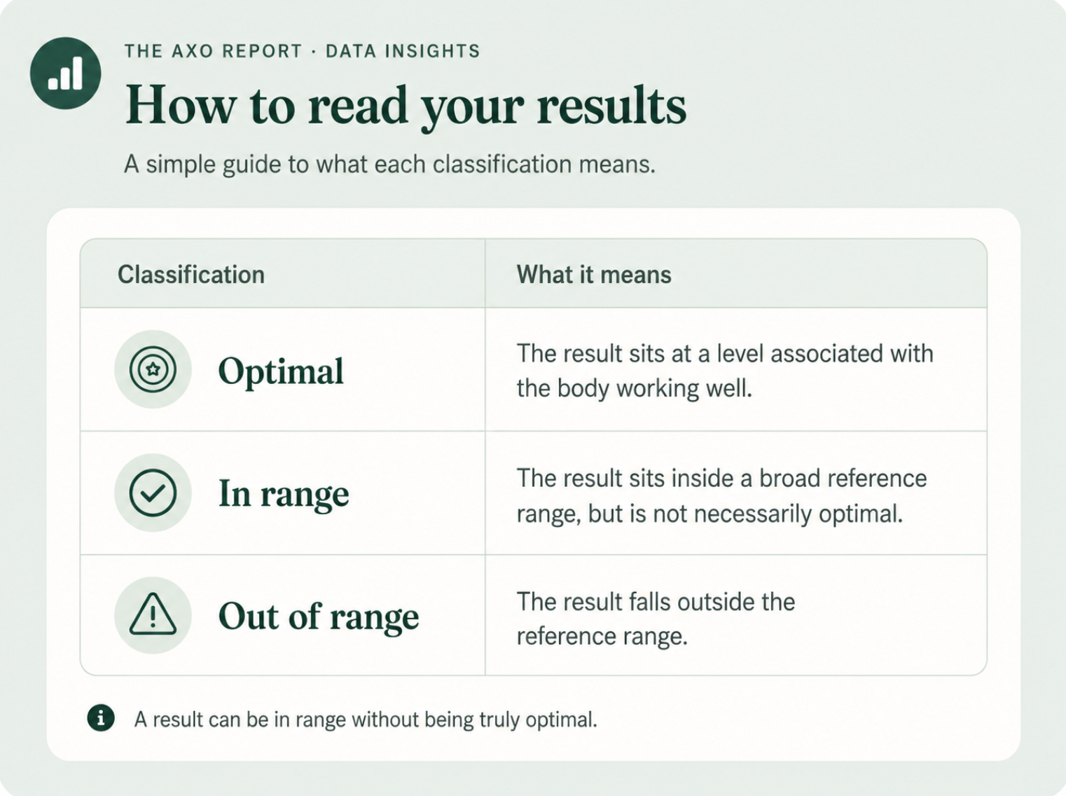
Three classifications are used throughout, taken directly from Axo's clinical reference ranges:
Two summary measures appear in places.
Let’s get into it.
Across the people who have tested with Axo, the single clearest finding is this: not one came back fully optimal. On average, only about 54% of measured markers reached a truly optimal level, and the typical person carried roughly nine or ten markers out of range, almost always without symptoms to point to them.
This holds in a population that is already proactive about health, the kind that invests in deep testing. If optimal is rare here, it is likely rarer still in the wider public.
Key takeaways
The headline pattern is its own finding. No one achieved a perfect score, the average optimal rate is about 54%, and the typical person carries around 9.6 markers out of range.
What makes this notable is its consistency. The optimal rate barely moves whether someone is tested on a smaller or larger panel, holding in a tight band rather than drifting with testing depth. That stability is the signature of a real ceiling: even motivated, well-resourced people tend to optimise roughly half of what is measurable, and no further, without targeted intervention.
The overall health score, around 86%, looks healthy at a glance. The gap between that number and the 54% optimal rate is the whole story of this report. Most results are technically fine and quietly suboptimal at the same time.
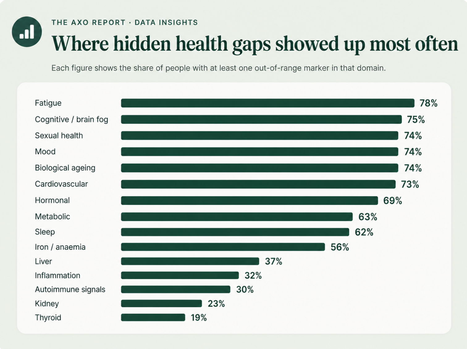
About 73% carried at least one cardiovascular marker out of range. The pattern is led by cholesterol: roughly 48% exceeded the European low-risk LDL target of 116 mg/dL and around 72% exceeded the moderate-risk target of 100 mg/dL, with a mean LDL sitting right at the guideline threshold.
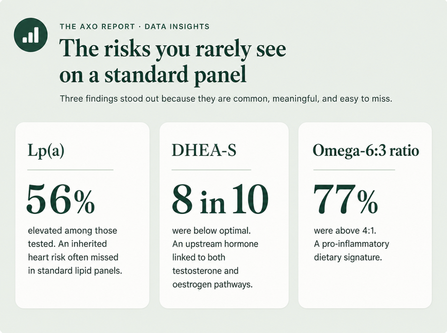
The standout is Lp(a). Among those tested, over half were elevated. Lp(a) is largely genetic, stable across life, and absent from a standard lipid panel, so most people never learn they carry it. Separately, around half had SHBG above 55 nmol/L, which reduces bioavailable testosterone and is independently associated with cardiovascular risk in men.
The hormonal picture is led by an upstream marker. Around 8 in 10 had below-optimal DHEA-S, the precursor that feeds both testosterone and oestrogen, and only about 1 in 5 reached optimal (about 21% were strictly out of range, the rest in range but below optimal). Roughly half had testosterone below a meaningful threshold, with a mean that sits in the lower part of the range. Leptin was out of range in about half of those tested, pointing to disrupted appetite and energy signalling.
DHEA-S is worth singling out because it sits upstream of much of the rest. Where it is depleted, the markers it feeds tend to follow.
Fatigue-linked markers were the single most common pattern, at about 78%. The important nuance is that this is rarely one deficiency. It is usually several stacked together, vitamin D (about 42%), iron saturation (about 25%), testosterone (about 31%), DHEA-S and haemoglobin (about 14%), which compound rather than simply add. That stacking is why fatigue is so often missed: each individual marker can look unremarkable while the combination is meaningful.
About 62% had at least one sleep-disrupting marker. The cortisol finding is the sharpest in the report: no one reached optimal cortisol, and around 15% sat in a clearly elevated, hyperarousal range. A near-universal stress-axis load is one of the most consistent signals in the dataset.
About 75% had markers linked to cognitive performance. The core cluster is vitamin D (about 43%), below-optimal omega-3 DHA (about two-thirds not optimal) and vitamin B12 status. Around 21% also tested ANA-positive, adding an autoimmune-linked dimension to the cognitive picture.
About 74% showed markers affecting sexual health, driven by the same hormonal cluster above: below-threshold testosterone, elevated SHBG reducing what is bioavailable, depleted DHEA-S and dysregulated leptin. The point is that this is a measurable, biochemical picture, independent of psychological factors.
Two findings stand out. Vitamin D was out of range in about 42%, with most of those sitting in the insufficient band (roughly a third between 20 and 30 ng/mL) rather than frankly deficient, and a cohort mean around 36 ng/mL. More striking is the omega balance: around 77% had an omega-6 to omega-3 ratio above the healthy 4:1 line, with a mean near 7:1. That is a clear dietary signature, and it persists even among people who eat carefully. Iron saturation (about 25%) and zinc (about 15%) round out the nutritional picture.
About 32% had at least one inflammatory marker out of range, though high-sensitivity CRP specifically was out of range in only about 11%. On the autoimmune side, around 21% tested ANA-positive and roughly 27% of those tested had elevated thyroid antibodies, a meaningful background level of autoimmune activity.
The metabolic cluster, cholesterol, glucose, HbA1c, triglycerides and insulin, affected about 63%. Around 11% sat in the pre-diabetic range on HbA1c, and total cholesterol was out of range in about 45%. Notably, fasting insulin was within range across the board, suggesting the metabolic risk here is more about lipids and early glucose drift than late-stage insulin resistance.
On a composite of ageing-related markers, about 1 in 9 showed accelerated biological ageing (three or more markers out of range), and more than a quarter showed moderate risk (two or more). In a health-conscious group, that is a sobering base rate, and a strong argument that the figure runs higher in the general population.
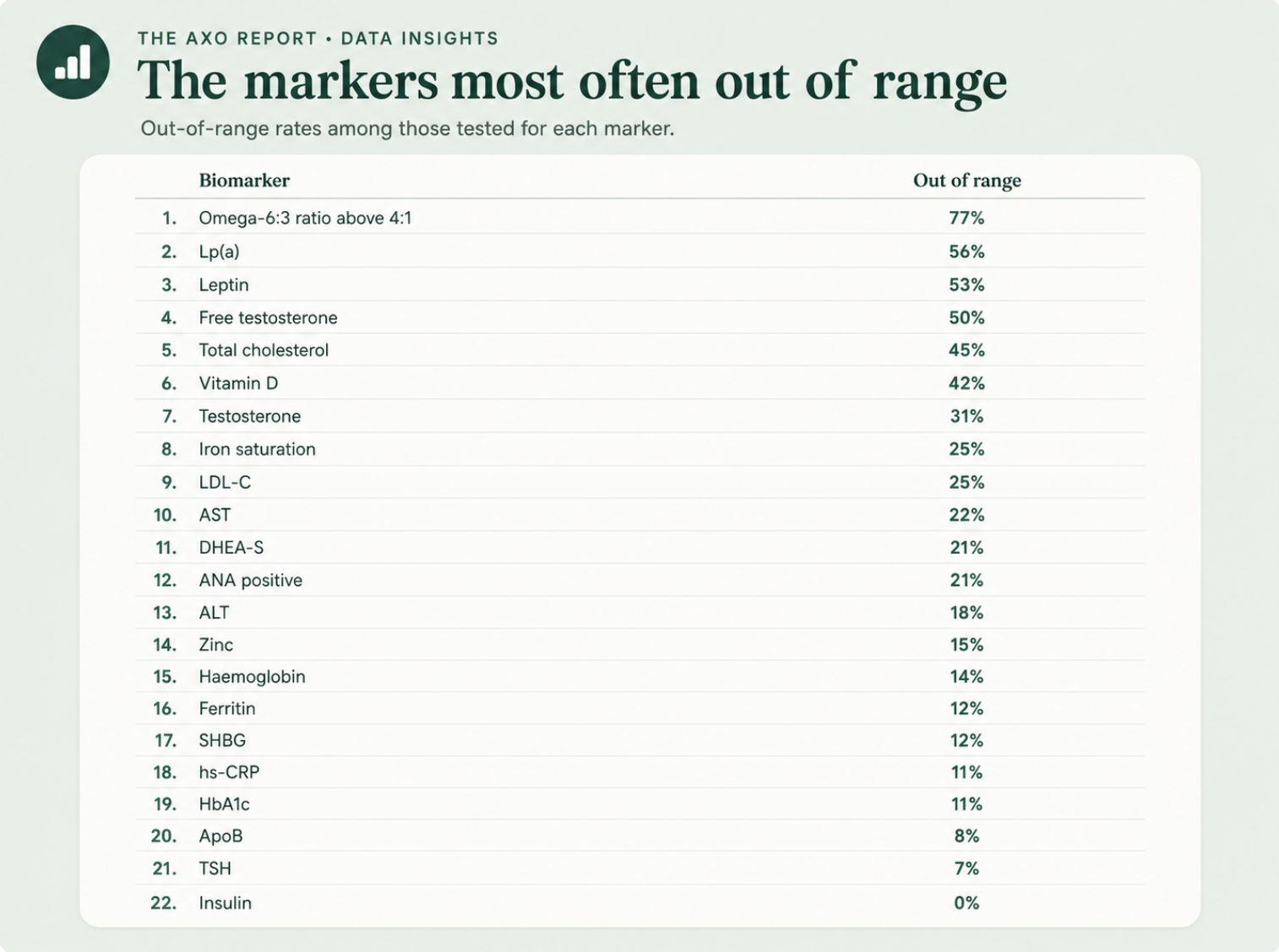
Out-of-range rates for the most clinically meaningful markers, among those tested for each.
The central analytic point is the distance between two numbers that both look fine: a health score near 86% and an optimal rate near 54%.
A routine blood test is built to catch illness. Its reference ranges are deliberately wide, set to flag disease across a whole population, so most results land comfortably inside them and most people are told everything looks normal. That is the right tool for ruling out disease, and a different job from showing how well someone is functioning.
Optimal is the higher bar, the level associated with the body working well rather than simply not being ill. The 32-point gap between health score and optimal rate is the population sitting in that middle band: in range, symptom-free, and not optimal. It is also where most of the modifiable risk in this dataset lives, in vitamin D, the omega ratio, hormonal regulators and early metabolic and cardiovascular drift.
These are prevalence figures, not causal findings. Percentages are calculated among those tested for each marker, so markers measured less often rest on smaller numbers.
Classifications depend on Axo's reference ranges, and "optimal" is by design a stricter bar than a conventional laboratory range. Nothing here is diagnostic at the individual level.
The data reflects a health-conscious group, which makes the prevalence of suboptimal and out-of-range markers a conservative floor rather than a ceiling.